How to Design an Online Food Ordering Website for Growing Takeaway Orders?
Does your restaurant have an online food ordering website? If no, then this is the right time to learn how to create a website from scratch. If you think why? Then here is your answer.
Online Gourmet chef home delivery is booming, and it’s an industry that is projected to keep growing and growing. Online food ordering is part of today’s culture. It changed the way people used to eat. The online food industry has expanded tremendously in just a time and this instantaneous growth has even created an enormous opportunity for food delivery start-ups. A recent study by the National food association in 2020 shows that the global revenue of the food industry is envisioned to exhibit a growth rate of 7.6% just within the upcoming two years. The immense choice of a wide array of restaurants and convenience is the biggest reason behind the enormous growth.
Online food ordering platforms have enlarged the convenience level of the buyers also enhanced the restaurants’ growth rate by producing their well-built online existence in the market. The COVID 19 pandemic has provided an additional boost to food delivery services. Restaurants that offered the option for contactless and safe food delivery was definitely survived through the quarantine and determine to carry on with this inventive option in the future.
Providing brand awareness through promotions is ultimately significant for brand building as well as communicate with your customers. This can be easily accomplished with the help of a dedicated web design company. With an online platform, you can showcase an endless amount of print information at a fraction of the cost and that information will be available 24/7 and you can also update the information anytime or from anywhere you want to.
Let’s have a look and learn how to build food delivering websites and earn more money.

Here is what all you need to attract the target customer with your food delivery website:
1. The website should be visually tempting and appealing.
High-quality and tempting images should be the most and prior factor in the entire food website design. People are stimulated to take action when they saw delicious and tempting food. The best way to stimulate such actions is by implementing an online food delivery website with appealing and tempting food images.
For instance, just imagine your customer is hungry and want some delicious food instant and the image of one of your top-selling classic burger with a refreshing cocktail will definitely boost their hunger level then they started visualising it after seeing it on your website.
Showcasing images of the different food items that make the dish look more tempting and captivating and people are more likely to buy it.
2. Should have a detailed menu.
A well-organised and detailed menu is a highly important factor in every food website. You only get one chance to make a first impression, and the best way to accomplish it through an online food website. Most restaurants have their own signature catalouge items depends on what they want to deliver to their customers and also depends on their preference. It is the finest way to make people understand the kind of food you offer. Maybe your customers desire to buy food for their friend, or their family a lovely meal, so ensure there’s something for everyone to enjoy.
The menu should update depends on the current trends and needs of your requirements. If the amount of dishes in your menu is big, your food delivery website should have a plethora of filtering and sorting options by food categories, cuisines, raw materials, etc.
3. Should have a user-friendly interface
Categorisation makes the whole website look skimmable and provides seamless navigation. Since a food delivery website is trying to put forward the exact dining experience of a restaurant experience, it should require an excellent browsing experience that is streamlined and direct. Just like how you help your customer to browse a menu in a restaurant, all the menu items should be displayed in front of a user.
Apart from that, it should show the delivery times and total expense. It is always the best option to denote the delivery time depends on the location and the slight variation may happen for valid reasons. That way, customers can choose your service accordingly, based on their time limitations
and schedules. At the same time, buyers should be able to understand clearly the delivery charges. Websites that hide delivery charges usually end up with a pile of negative reviews. Transparency in pricing is pivotal for enhancing the user experience.
4. Safe online payment
The payment gateway that you use on your website should be secure while customers making a purchase. Because every time they trusting your service and hence provide you with sensitive data by means of credit/debit cards. Nowadays restaurant business is the one which declared with the maximum number of malware. Since it is more beneficial for unethical spammers to hack the food industry because of the sensitive and immense data it offers. Mainly because of the type of data it has such as credit card/debit card details, email Id, passwords, personal number, and so on. So protecting these confidential data is highly necessary for the survival of your restaurant business too.
No matter how big or small your restaurant is, unprotected payment processes or even a cyber- attack will tremendously affect your business reputation and reduces diner confidence. It’s true that online food delivery has become more popular with its affordability and convenience. With the right takeaway website, the possibility to touch the sky is even more clear. But that doesn’t mean online food delivery has no flaws or shortcomings. Since customers are our pillars for success taking necessary action to protect all payment methods is highly necessary for covering their business from threats and also for help your restaurant to run fruitfully for a long period.
5. Clear calls-to-action button.
Proper placing of CTA buttons is essential since it encourages your customers to take action. They help the customers to navigate to a landing page and guide them for sale conversion. It should be feature striking and action-oriented text such us like add to cart, buy now or get now, etc. The colour of the CTA button also matters a lot. Reports suggest that green and orange performs well. Depends on your entire website design pick a colour that strikes out the customers to perform the action.
Your button size also needs to be large enough to read easily and see easily but at the same time, it should not be too large and looks obnoxious or intimidating. Of course, you never want a ”Honey, I Blew Up the Kid” situation. To acquire the customers’ attention, the call to action button is approximately 20% larger than your logo. The position of the call to action buttons on a website is crucial to grabbing the attention of users. Placement in eminent areas such as the top part of a web page can lead the way to favourable landing page conversions and enhance the sales cycle because customers will doubtlessly observe the call to action button and take action.
What are the different types of online food delivery businesses?
Generally, there are two models and you can build your business according to them.
• Local Vs Global
In the local method, you can sell your food to the local areas which are close to your physical store. It is one of the best ways to uplift brand awareness in that particular location through a local business website. It is an amalgamation of order-focused food delivery services and logistics-based food delivery services. But in the global model, you can offer the food worldwide and hence have a million customers. It is often called platform-to-consumer delivery. They are the mediators or third- party between the local restaurants and the customers. Through a single website or mobile application, they provide access to a wide array of cuisines and restaurants.
• Cooperation Method
The cooperation method has three parts Order only, Order and delivery, and Full integration. In the first method, Order only, your website provides access to place orders from third-party services and the responsibility for delivering the food is totally up to them. In the Order and delivery method, you are responsible for taking orders as well as providing delivery. Finally, the Full integration method, here from the making to deliver each and every process is controlled and managed by you only.
How to optimise your online food delivery platform?
Just creating a website doesn’t help you in getting a lot of customers and productivity. For that optimisation is highly important. Optimising the website according to the technical demands, customer needs, market trends are the stepping stones towards success.
So let’s how to optimise a website for better performance:
1. Responsive menu
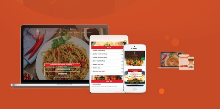
Make the whole browsing experience seamless. It should have access to any device like desktops, laptops, smartphones or even tablets. Since most of the browsing is done through mobiles, mobile- friendly websites have a great demand. Restauranteurs should make sure that their platform works well on all devices. You can also enhance your online orders by merging your online catalouge with a restaurant online ordering system. This allows you to diminish expenses by streamlining your ordering software. By bringing all your in-restaurant orders and online orders under an umbrella, making it simple for you to accomplish all of the orders.
While creating a responsive menu make sure about the page size and the loading time. Studies show that if a website takes more than 5 seconds to load people have a great tendency to bounce from that website and click on the next available one. Reducing the page size and the image size is the best way to overcome such problems. Make neat and well-organised sections. Organize the menu into sections such as giving a separate space for breakfast, lunch, and dinner, separate them perceptibly and make sure they are arranged in a logical order or based on a particular cuisine.
Arrange it according to the prerequisites of your customers.
2. Loyalty programs and discount offers
One thing people are mostly attracted to is discounts and special offers. You can definitely notice the tremendously working of the call to action button if you put a deal like ” 50% OFF on First Two Orders”, ”Get a free meal on first order” or ”Free Delivery”. Discounts and loyalty programs are the best way to promote your business to a wide range of people. Discounts can be provided in different ways, either through promo codes, referral codes, coupons, etc. Push alerts or pinning the discount offers on your website helps to grab the attention of your loyal customers.
Offer Discounts. Attract New Buyers. Repeat.
This is how the buying cycle works. If your special offer is only applicable for only a certain period of time, use this strategy to attract more people by advertising the same through pop-ups messages. People usually show a great tendency to rush into your website or app and take a look at it to make sure if they have enough days to do so. Your website will definitely undergo more traffic, so you may require to arrange extra staff during the discount time so that the service became smooth and effortless.
3. A/B test your online platform
You launched a website, you got a pile of customers, your sales cycle and profit increased and you became a billionaire!
Is it really this simple? Of course, Not!
It is not all bubblegum and roses. Of course, you will have challenges. But you can overcome it with a trial and error method.
A/B testing or split testing is one of the most powerful and finest methods to boost the performance of all the significant metrics in your business. You can even test two copy lines of your service and find out which one works better. It’s a repetitive procedure with each test is conducted based on the results of the previous tests. A/B testing should be done consistently and with focus. In the initial stages, you may not see massive gains or huge differences in the growth curve; however, with the time you will definitely see miracles, you will be astonished at the overall enhancement if you use it well.
Reaching the utmost level of success needs a pile of factors. Using good images, well-written content, maintaining customer happiness, keeping up with trends all are obvious prerequisites. We hope this piece of information will help you in understanding all need for building a perfect online food delivering platform which makes your business thrive.


